Let’s finish up the initial design of our homepage today.
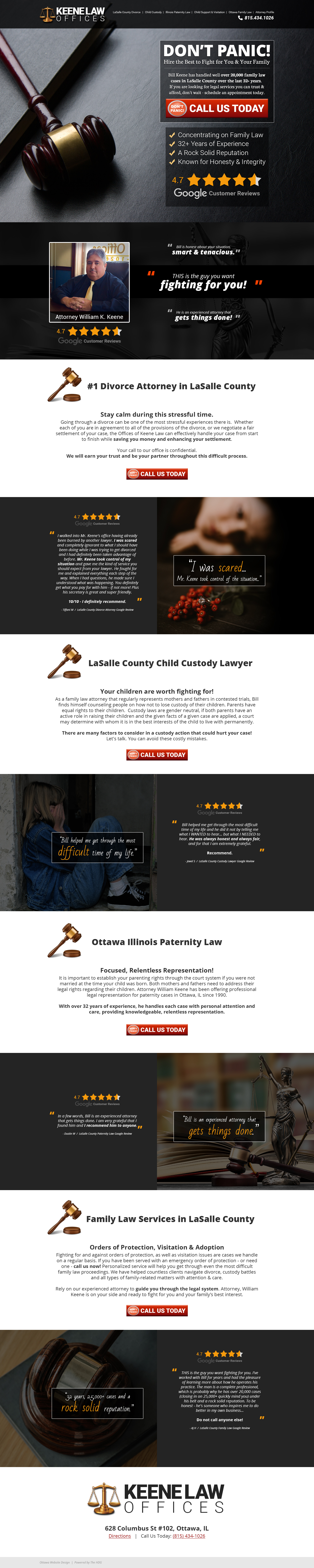
To date, we have worked up a solid hero section, followed by a series of mobile-friendly content areas filled with trust indicators.
One thing I forgot to mention, was the top navigation.
Here’s the most important thing you need to remember when you are designing the top navigation for your site: website users expect to find certain things in specific places – and it is in your best interest to avoid confusing them. This can be frustrating for designers, because we want to be creative… but if you want to max out ROI, there is a time and place for creativity.
The top nav is not an area where creativity is appreciated.
Top Navigation Best Practice Examples:
- If you’re a service business that books appointments with customers, they expect to see a “contact us” link and/or a phone number.
- If you’re a restaurant, a link for directions and/or online ordering needs to be prominent.
- If you are an online store, they expect to see their cart (usually an icon with the number of items they have added) up at the top right.
- Account access (again, usually an icon with a link to “log in”) is common at the top right for online stores as well.
- In both instances, users expect to see the company name / logo in the top left.
- A prominent search bar – dead center, between the logo and the account & cart icons – is also expected for online stores.
Don’t confuse people.
Since this site will focus on local SEO (Search Engine Optimization) and scheduling appointments, our top nav is very simple.
We have an updated, clean logo, and a single line of text links (with keywords that Bill wants to rank for locally) along with the office phone number.

Simple. Effective. Clean. Not confusing.
This will allow visitors to navigate the content easily. On mobile, we’ll use a hamburger menu – the three bars that when clicked, open a drop-down or drawer with our links.
Max width will be set to 1200 pixels, which will keep our content at an easy-to-read size and prevent desktop users from being delivered content that is 2 miles long, and hard to read.
What do I do if my website is confusing?
If you’re worried that your website might be confusing, it’s a good idea to have someone complete a full website audit. Just make sure you hire a website professional with a proven track record, not a snake oil salesman who plans to simply run your site through some online tool that “automatically generates a report”.
Those are trash. You need real eyes on your site. Don’t sell yourself and your business short.
Back to content:
We’ll work our way down to the footer, listing 3 more main service areas, followed by 3 more Google reviews to act as trust indicators.
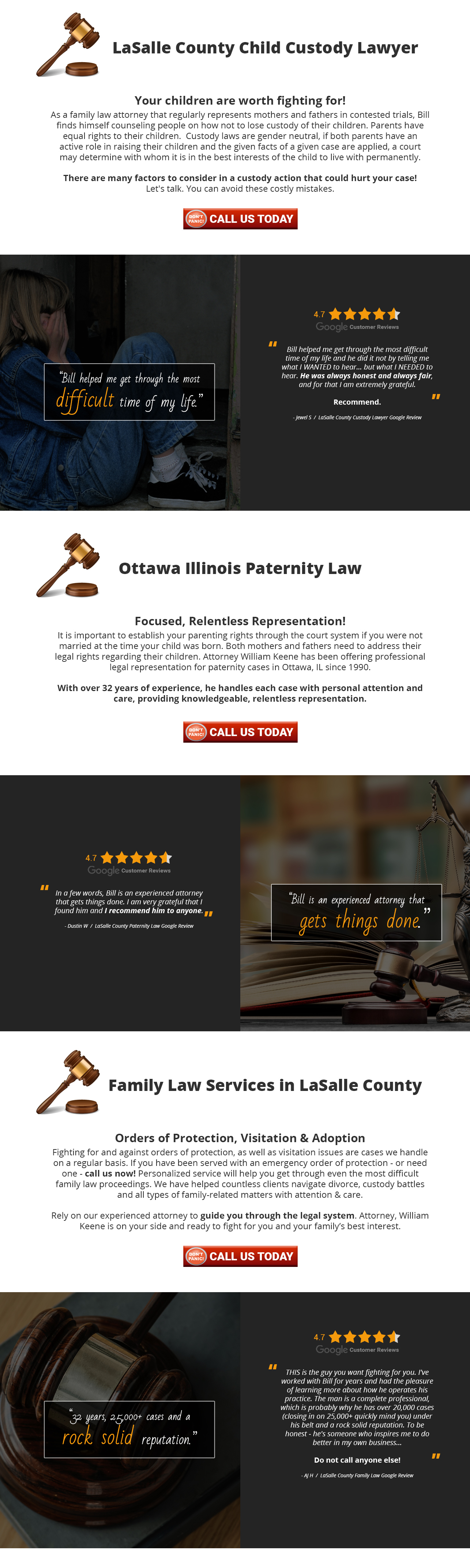
Finally, with no more content to add, we arrive at the footer.
For this site, I decided to keep it simple. The logo, a link for directions, and the office phone number.
Why add extra clutter if it’s not necessary?
One could argue the footer is a good place for internal linking, and also a good place to list your social media icons, but those are topics for another day… do NOT make the mistake of placing your social media links and icons in the header or hero section unless you consider someone leaving your website to look at your social sites a conversion.
If that is your goal, go ahead. If it is not your goal, don’t make this mistake.
We’re done.
Time for a video review of the full page, and now we enter The Approval Gap – my least favorite part. This is the time between the delivery of a design, and approval from the customer.
However, as I explain the concepts behind all of the layout decisions that were made in this example, I have a pretty good feeling…
How it started:

How it’s going:
Here is another example showing how many of the same website design principles you would use on a service website, overlap websites design principles for online stores selling physical products.
Not all – but some.
Enjoy the rest of your day, and get some work done!

Leave a comment