
Overview
Client:
Sterling Woodworks is a high-end cabinetry & woodworking company known for timeless craftsmanship and attention to detail. The Team (led by owner Scott Hibbard & creative director Megan Wheeler) designs, builds, and installs premium wood interiors with a personal, hands-on approach.
Project Objectives:
Develop a website that matched the quality, care, and creativity SWW brings to every project. Build a clean, welcoming, and professional platform that speaks to ideal clients and supports storytelling, education, and future growth.
Deliverables:
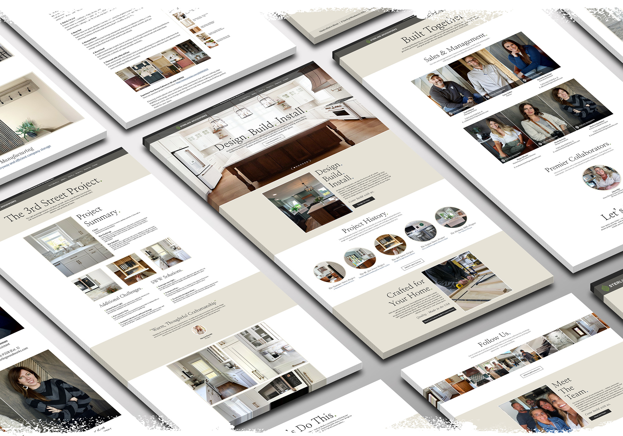
Full website redesign with refined messaging, clear structure, and intentional visuals. Includes a dynamic project portfolio, The Workbench blog, personality-driven team page, and CTA pathways designed to deepen trust & increase inquiries.

Quick Wins
Authentic, Usable, and Intentional
I designed the new website to reflect the warmth, clarity, and craftsmanship at the heart of SWW.

Brand-Aligned Messaging
Refined color palette, voice & structure to feel premium & approachable.

Sharper Portfolio Experience
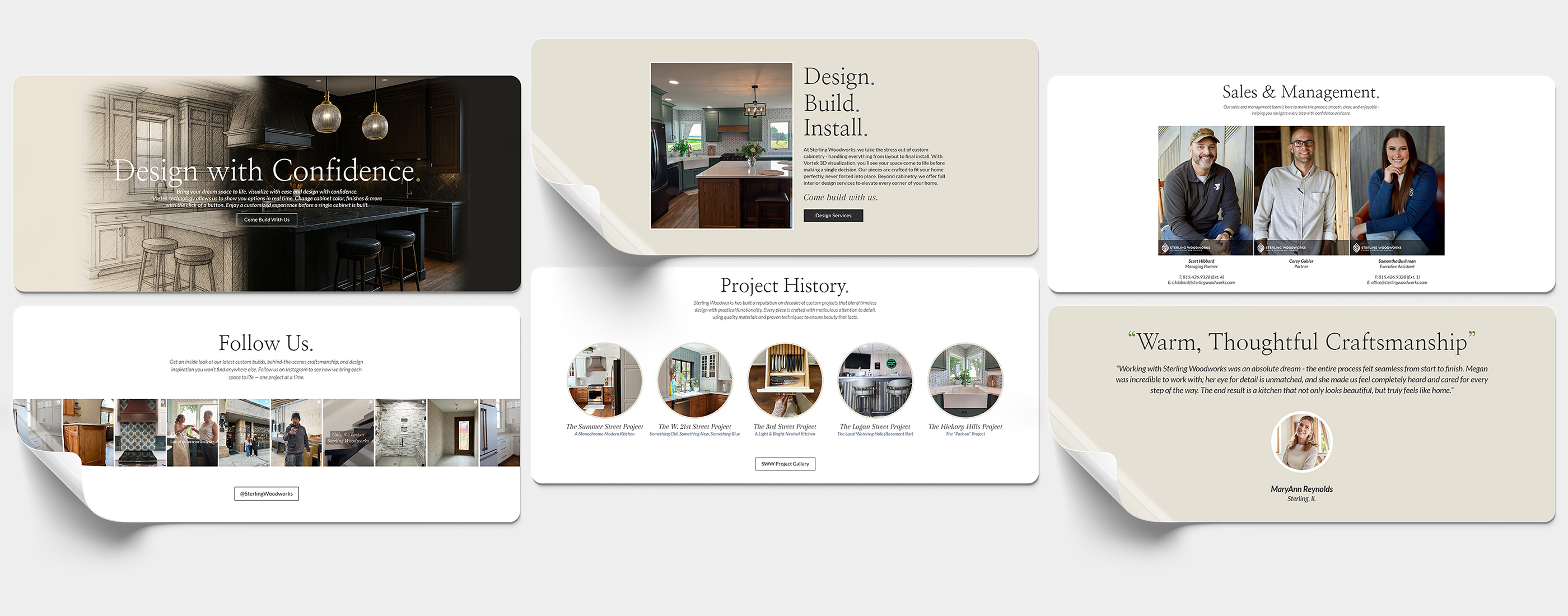
Each project now has room to breathe, with space for details, visuals & social sharing.

Not Just “A Blog”
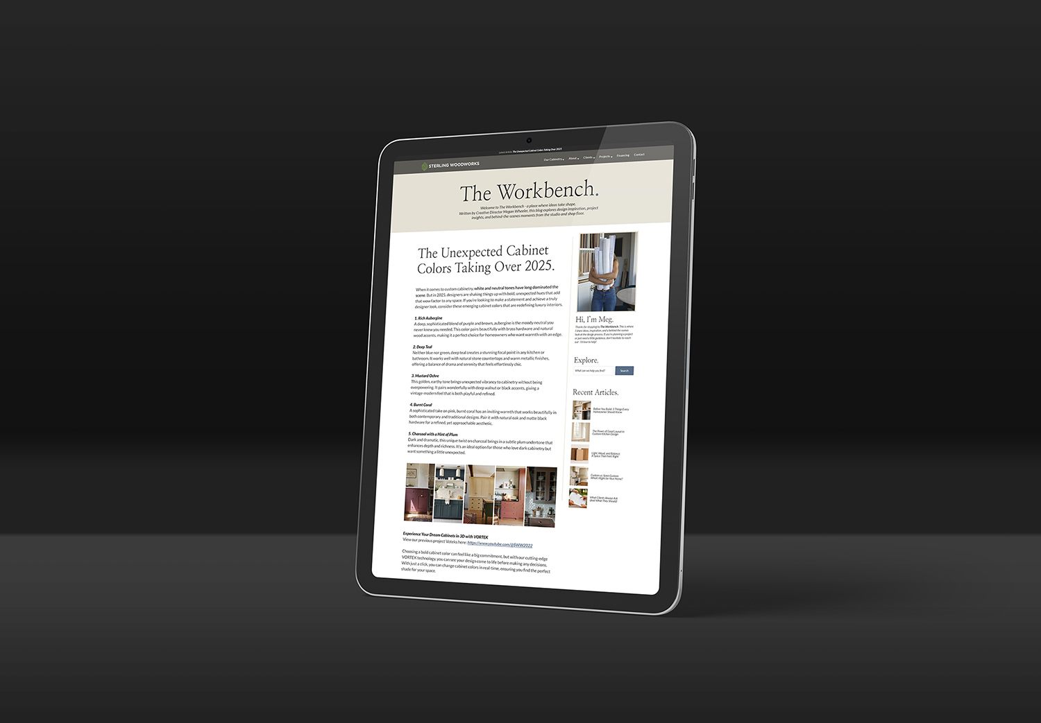
Introduced The Workbench – a blog built around Meg’s voice and vision.

Developed for Growth
Flexible CMS is scalable and modular sections make future updates easy.
Backstory & Challenges
From Contractor to Crafted

Sterling Woodworks and I go way back. About five years ago, I partnered with owner Scott Hibbard on a full website redesign. It was a solid. Professional and organized. But it leaned more toward a traditional contractor aesthetic: clean & capable; not particularly refined.
When Creative Director Megan Wheeler stepped into the picture, she brought a new energy and vision. She wanted a site that felt elevated, intentional, and more in line with premium lifestyle brands like Studio McGee and The Lifestyled Co. The inspiration made sense, but I had one concern: those reference sites, while beautiful, felt cold. And SWW? They’re not cold. They’re approachable, and deeply personal.
After a few open, thoughtful conversations, the direction became clear. We’d aim for a modern, high-end feel, but warm it up with earth tones, gentle greens, and a cool blue accent for contrast. The typography system followed suit: refined but readable, pairing Nanum Myeongjo and Arapey Italic with Lato Regular for clarity and flow. In a word, the visual tone had to feel approachable – elegant without ego.
The end result struck the balance perfectly. Megan and Scott both loved it. And since launch, we’ve begun collaborating on two additional (off-the-record) projects that extend beyond the SWW ecosystem – a clear sign that our partnership works.

New Design Work Below


The 5-Step Approach
Designed Together
This project was built from conversations.
Over the course of several working sessions, email threads, and feedback loops, we shaped the new Sterling Woodworks website to reflect the care, warmth, and precision that defines their work. Megan brought a clear design sensibility and brand vision to the table. I brought structure, strategy, and a relentless focus on clarity.
Together, we refined every detail, from messaging to layout, fonts, color palette, images and more, until it felt exactly right.
We broke the project into 5 key phases:
- Clarify the Message
We rewrote the core brand narrative and callouts to reflect SWW’s process: Design. Build. Install. Jargon and contractor language were eliminated and replaced with intentional, client-focused copy. - Rebuild the Structure
Using best practices in UX hierarchy, we created a layout system that guides the user while giving the team flexibility. High-impact items were placed prominently, and new trust signals were incorporated. - Elevate the Portfolio
We transformed the portfolio from a bland image gallery, into a flexible storytelling system. Custom blurbs, high-quality photos, the ability to share, and most importantly: a story for every project. - Build a Blog That’s Worth Reading
Megan wanted to share ideas & inspiration. I pitched The Workbench. A unique, branded space built for storytelling. Clean, intentional, and designed to reflect her voice, it’s much more than a boring blog. - Design for Flexibility
Everything was built modular by design. Sections can be moved or repurposed across the site without breaking the layout or needing a developer. The site can grow and evolve right alongside the business.

Collab Highlights
Genuine Teamwork


Working with Meg was easy, productive, and fun.
Our Favorite Project Wins:
• Aligned on a warmer, high-end design direction
• Custom typography strikes the “approachable luxury” tone
• Color palette builds and supports a warm foundation
• Refined messaging reflects SWW’s depth of experience
• Clean, clear, simple CTAs increase conversions
• The Workbench: a unique take on boring business blogs
• Restructured portfolio is sharable and lets projects “speak”
• SEO optimized for broader reach
• Mobile-friendly to maximize audience

Modular by Design
For Maximum Customization
The site is built in modular blocks. Sections can be moved, swapped, or duplicated to fit evolving needs. Each module is designed to breathe. This method gives SWW complete control over how their story is told.
New modules can be deployed without requiring a full redesign, increasing the lifespan of the site as it grows alongside the business.


Final Deliverables

The completed website is a custom-built, fully responsive platform that reflects the warmth, craftsmanship, and clarity Sterling Woodworks is known for. Deliverables included a modern redesigned homepage, modular service pages, a storytelling-driven portfolio system, a personality-rich team page, and The Workbench.
SWW is now perfectly positioned to grow. The site gives the team full control to adapt, evolve, and expand their content with ease, without compromising design integrity.
Every detail aims for clarity, beauty and approachability. It’s a better way to experience Sterling Woodworks.
thoughtful design elevates everything
Whether it’s custom cabinetry, academy course assets, or anything in between – I design with clarity, care, and long-term impact in mind. Let’s make something great together.
