New year. New look. New goals. New fire.
Today is January 1st.
Everyone else is sleeping off their hangovers.
It’s go time.
I sat down this morning with a simple goal: create a logo that’s more professional, more attractive, and a better representation of what I can do for my clients.
Ok… so maybe that goal wasn’t as simple as I thought…
I started consulting for website projects about 4 years ago. It was a logical step, after spending over 15 years in the trenches designing & developing websites. It made sense for me to take a more active role in website projects. Not just participate as some grunt that could “do the Photoshop” – but instead, offer expert direction and guidance based on what I had seen work in the real world for both big & small clients.
It’s worked out well.
You want strategies and guidance? Fix My Website
You want technical website help? The Hauser Design Group
You’re not sure? No worries. Schedule a Website Consulting Call
It’s a great setup – and time to kick it up a notch.
A new logo is just what the doctor ordered.
Still… it’s always easier to work on a project for someone else. This is true for most people, most of the time (and another great reason to get a second opinion and hire a consultant that can help you focus on tasks that matter), but today I decided to throw emotion aside and knuckle down.
Here’s how it went…
The Evolution of a Logo
When I started consulting on websites, I wasn’t sure how I’d ultimately market the services that were offered. Truth be told, I didn’t even know what those would be – but I knew that they would evolve in time if I just did the work.
So I jumped in, and did what all small businesses do: started working under my own name, and set up AJH Consulting.
Oof.
SUPER lame.
However, I knew that the most important thing, was to start. Just start. I would give this same advice to a client – don’t get analysis paralysis, just get to work.
You’re going to suck. Embrace it.
You won’t know everything. Embrace that too – because if you do the work, one day you’ll look back and laugh at everything you didn’t know.
It happens to all of us.
Just start – the rest will come.
V2: Your Shopify Coach
A great way to focus your marketing efforts, is to niche down. Get very specific about what you do, and who you can help.
I wanted to focus on an ecommerce platform that I knew really well – so, I became Your Shopify Coach.
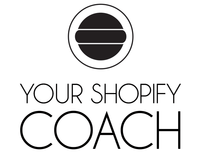
This logo was completely unique, because it stood for nothing.
Literally nothing.
That symbol?
Means nothing.
And what is a “Shopify Coach”?
Is it someone who helps you set up a Shopify store? Someone who helps improve your site speed? A conversion expert? Someone who can increase your AOV (Average Order Value)? Someone who can build organic SEO or help with marketing?
… all of the above?
Unlikely.
A jack-of-all-trades is a master of none.
Scrapped it, because even though I thought it looked and sounded cool at first, it brought nothing of substance to the table.
V3: Fix My Site
The version that came after Your Shopify Coach was better – because it allowed me to say what I do in a few short words – and this quickly tells visitors what they can expect.
I fix sites.
See my wrench?
That means I work on stuff.
… ‘cuz tools.
“Dang, this wrench guy is going to fix my site!”
Yup.
However, after living with this for a few years, I’ve realized there are two major problems with this logo…
First off, what is a “site“?
A job site? A work site? The site of a major event or an accident? Think about it – are people going to be searching for the term “site” or “website” if they are looking for a website expert?
We need to fix this problem.
Secondly, the wrench is an issue because it focuses on the work I plan to do, not the results my customers can expect to receive.
What are your customers most interested in?
The results they can expect to receive, or the tools you’ll use to do your work?
Right.
They don’t care how we get from point A to point B, they just care that we get from A to B!
They are paying for a result – the means don’t matter to them.
V4: Fix My WEBsite
We need something that looks cohesive. The symbol needs to be a part of the overall design, not slapped on as an afterthought. It needs to look professional and easy to read. I want to incorporate blue, because blue is a trustworthy color.
I need to focus on what my clients want and expect: Growth.
Website growth.
Increases in traffic, sales & conversions. Email list sign ups, and digital downloads. Everything (that matters) trending upwards.
It also has to look good on solid-color backgrounds, at any size.
The new design does all of this, and it’s going to allow me to create better marketing material across the board.
What do you think – how does your logo look to you after reading this?
When you run a business, evolution is good. Make sure you never stop! My businesses aren’t perfect. Far from it. They will continue to evolve and grow just like yours.
Next?
We need to overhaul the website… but not today. I’m spent…
Enjoy the rest of your day, and get some work done!

Leave a comment