Happy New Year!
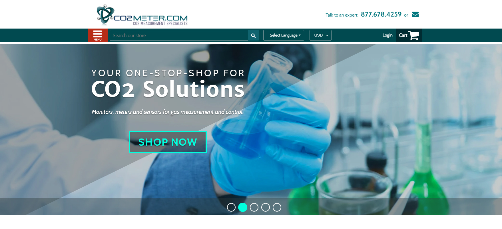
Last week we were able to finish up a header redesign at The Hauser Design Group for one of our favorite customers, CO2Meter.com.
This was simply a top nav + hero section redesign, not a complete homepage redesign (like the recent project for Bill Keene of Ottawa, Illinois).
That said, many of the exact same principles were utilized, so I wanted to point out how the same concepts can be effective for different businesses selling products vs services.
- Cleaner, aligned sections = more professional
- Cleaner, aligned sections = less confusion
- Clear calls to action via red buttons scream “CLICK ME!”
- Review stars emphasized as trust indicators
- Customer requested the “side-by-side” hero layout and asked for “room to make a claim on one side, and prove it on the other” – really cool idea, but since we’re featuring a product to start, our end result is a bit different
- Static image & text usually perform better than moving hero sliders containing multiple images – meaning more clicks and conversions
Hero Section Redesign for CO2Meter.com – Before
Hero Section Redesign for CO2Meter.com – After
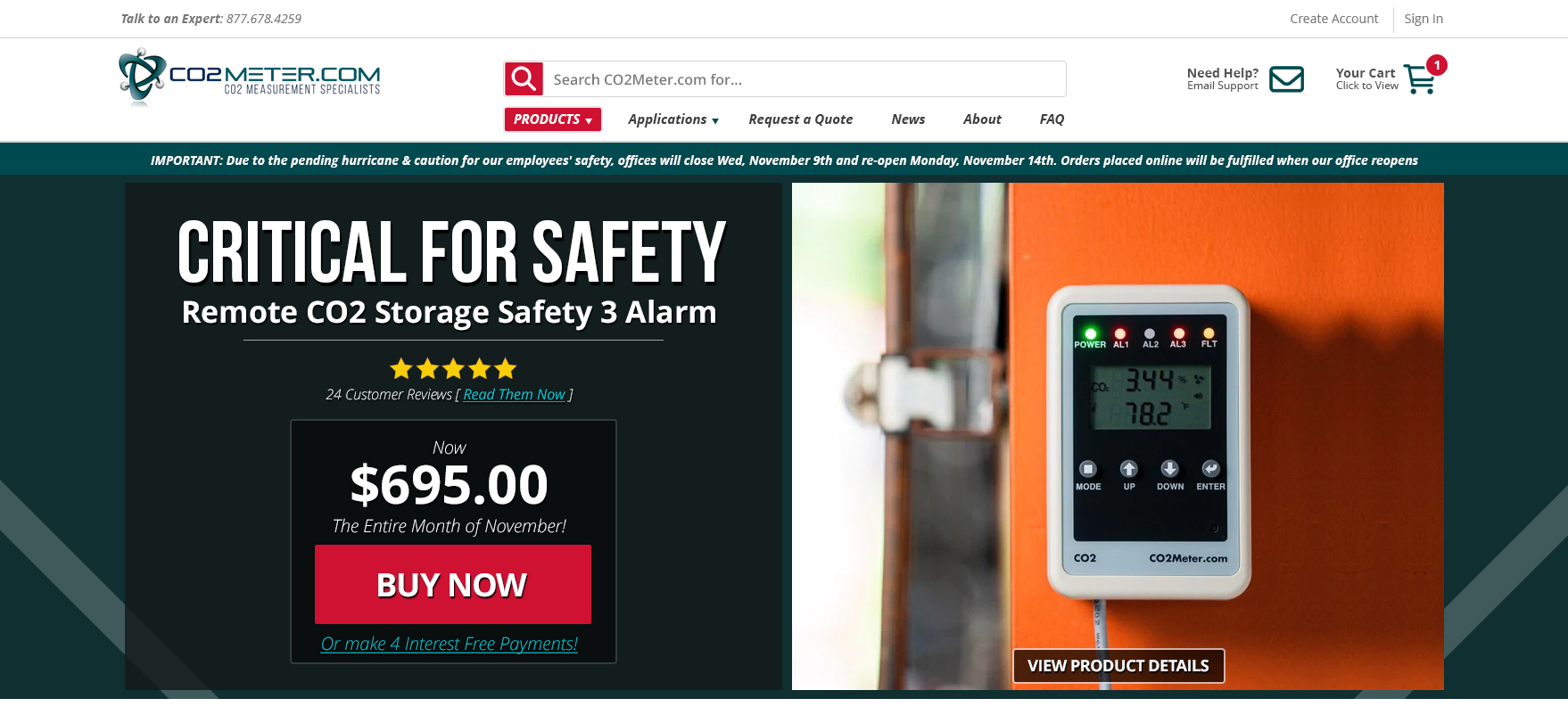
Cleaner everything.
Clearer direction.
Helpful info more prominent.
They were very happy – and we were too.
If you need some direction on your next website project, it might be a good idea to hire a website consultant with 20+ years of experience.
Remember: many of the same website design principles you would use on a service website, overlap websites design principles for online stores selling physical products.
Not all – but some.
Enjoy the rest of your day, and get some work done!

Leave a comment